I’ve been working on a new direction. I want to make increasingly maximilist versions of objects in my house that have significance, energy, or are expressive of our life here. I often think people pigeon hole middle age with children as a sort of greyed out, boring series of unchosen events. The reality could not be more different.
My experience of having a life with small children has been a blast furnace of all my emotions, supercharged. Love, fear, sadness, anger, joy- even the obvious choices are huge, and there is a deep pool of subtle, less readily articulated feelings that poignantly surface at the least expected times.
I’ve started by trying to recenter my art practice. I’ve been taking pictures around the house and reading books on Cezanne. I’ve done some sketching, but I’ve been trying to get to painting as quickly as possible, and work more with colors than with black and white. I started with a mostly 2 dimensional painting. The canvas is wood that slightly depresses where a bowl might, and I also use caulking to put some weight to different objects. Mainly, this is the flattest version of this idea:
I like how it turned out- I’ve been trying to proportion things a little bit more by feeling and less by realistic representation. The white space, for instance, underneath the key changes every time.
Next I tried to do a more choppy, disrupted, fragmented version with more green and less blue:
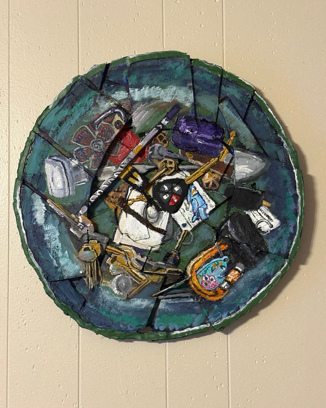
I think this wound up not working as well for me- I missed the blue. Something about it didn’t resolve as well, either, and the respective weight of the objects felt wrong. The textures of the keys were good- some of those are wood and some of those are paint. There is stuff here I’d like to circle back to- some of the textures are really good and there is something I want to develop with the brush strokes here. They don’t all the way work this time, but there’s something to keep around potentially.
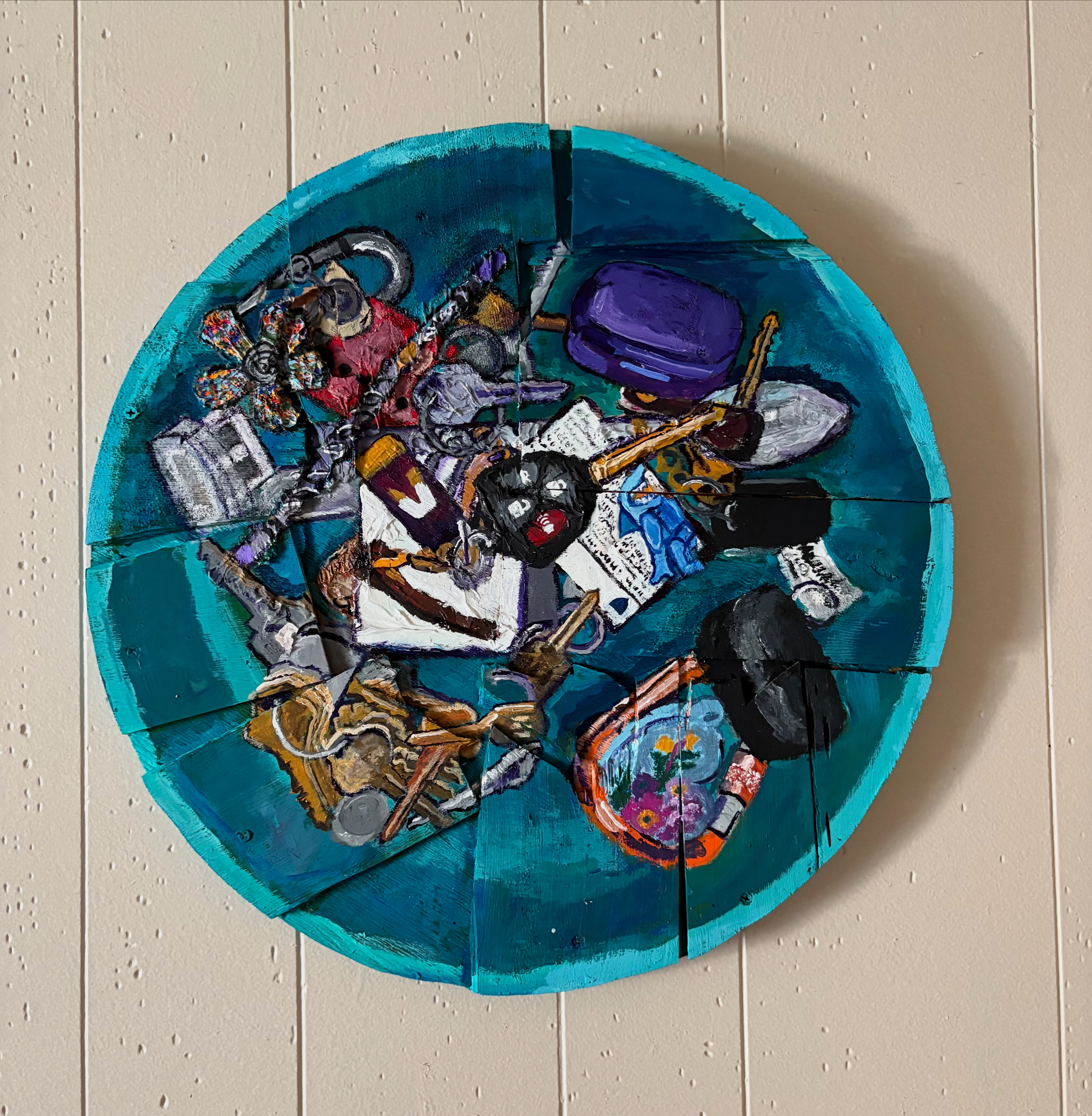
Next, my last version- I just went full 3D, making it way larger than the real key bowl and using the lessons learned from the previous two iterations to make something I feel really good about:

You can see the weight and size of the objects is much different here. The key is larger, the lego shark man key chain is gone, and the colors pop and work off of each other really vividly. There is much less black and white- the white spaces are shades of pink, though I’d like to work that differently in the future; maybe make a stronger hue of pink and balance the colors more, instead of washing the pink out until it’s close to white. It feels like cheating to lighten it that much. The blacks are a deep, deep purple I’ve started replacing all my blacks with- I really like it, it’s powerful – it enriches where black deadens.
What I’d like to do is make still lives that are charged with all the power of a well made abstract painting, maximizing theory so that the art feels incredible to engage with. It’ll be a journey, but I think with enough time and work I can pull it off.
