These portraits are coming much easier
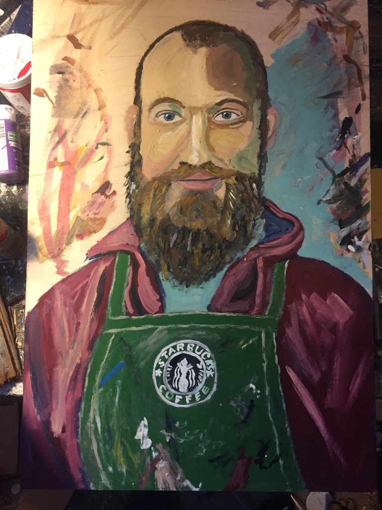


Deciding where the glass goes is getting to be pretty difficult. I would like to do more extravagant portraits. Those are coming. I think up until now I’ve been trying to stick the landing on just…better, more accurate portraits. I’ve been consciously updating the portraits I did ten years ago from London Underground. Same dimensions, same kind of aesthetic- just better. More engaging, more accurate, hopefully more thought provoking. Here are some of the portraits I made then:

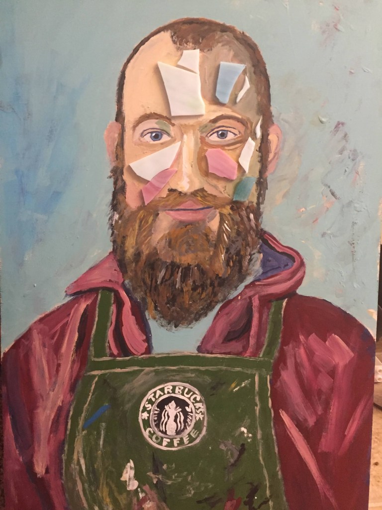
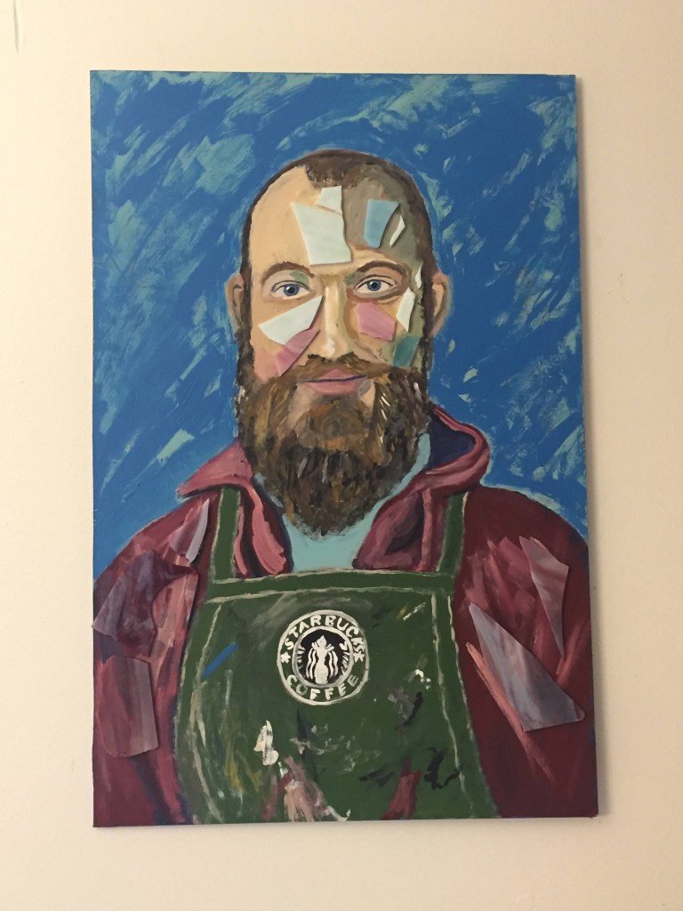
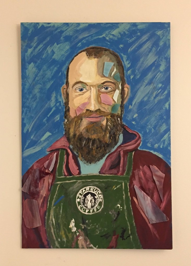
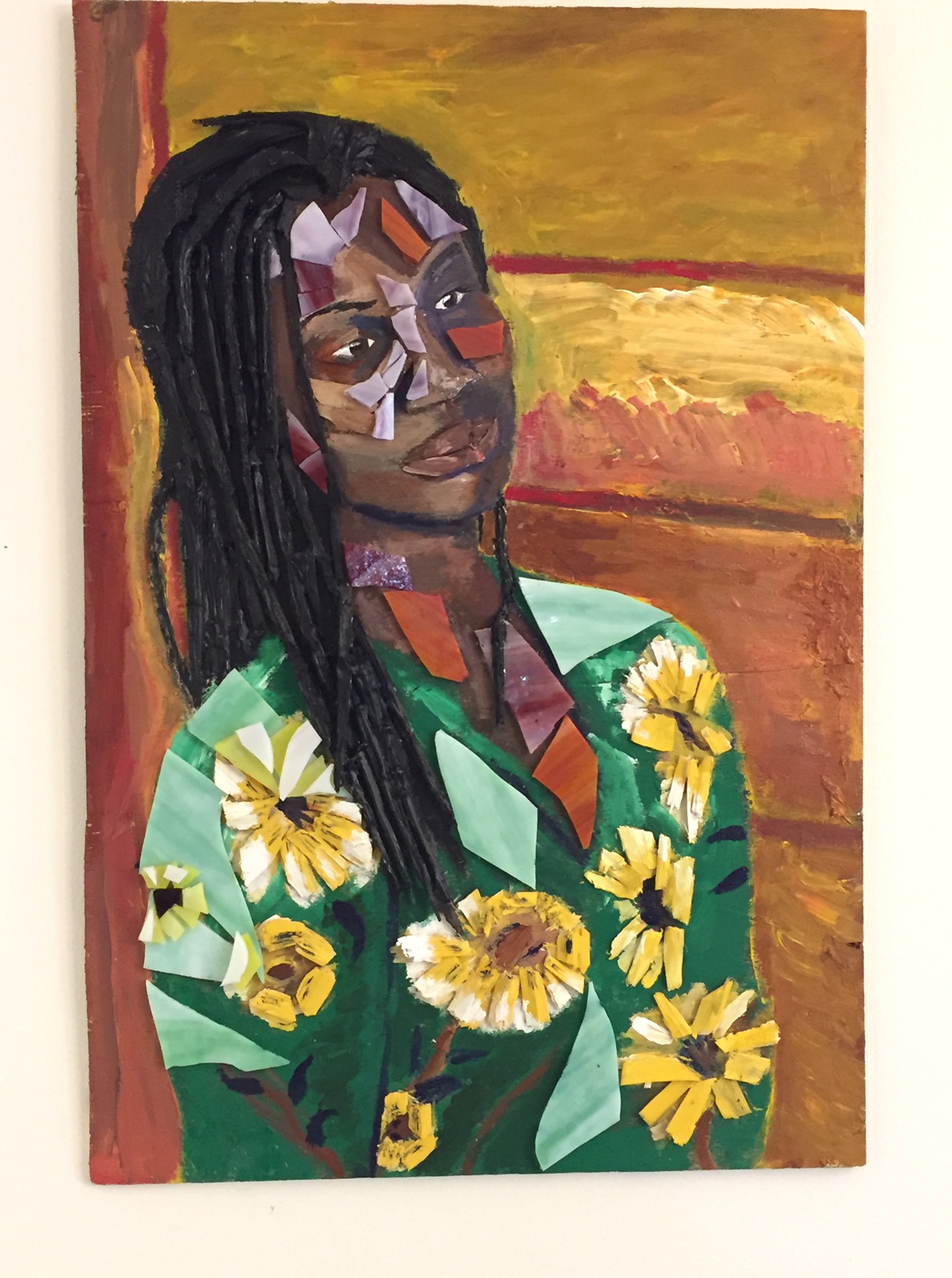
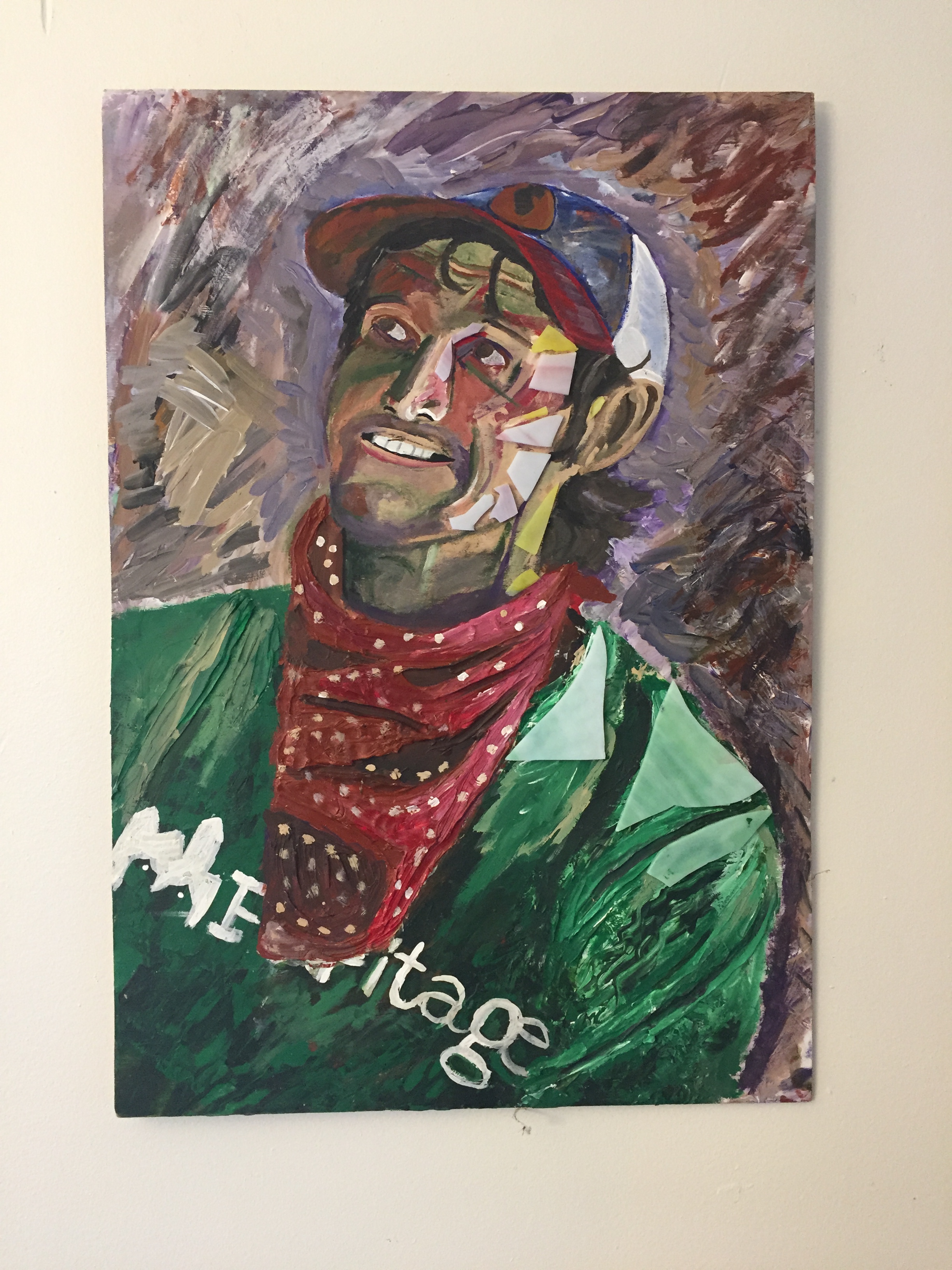
While there’s something I still like about these- the simplicity, the clear attempt to solve problems, the color style, the cut paper, they are definitely a lot more rudimentary. For comparison, here is the N. Braddock series so far:

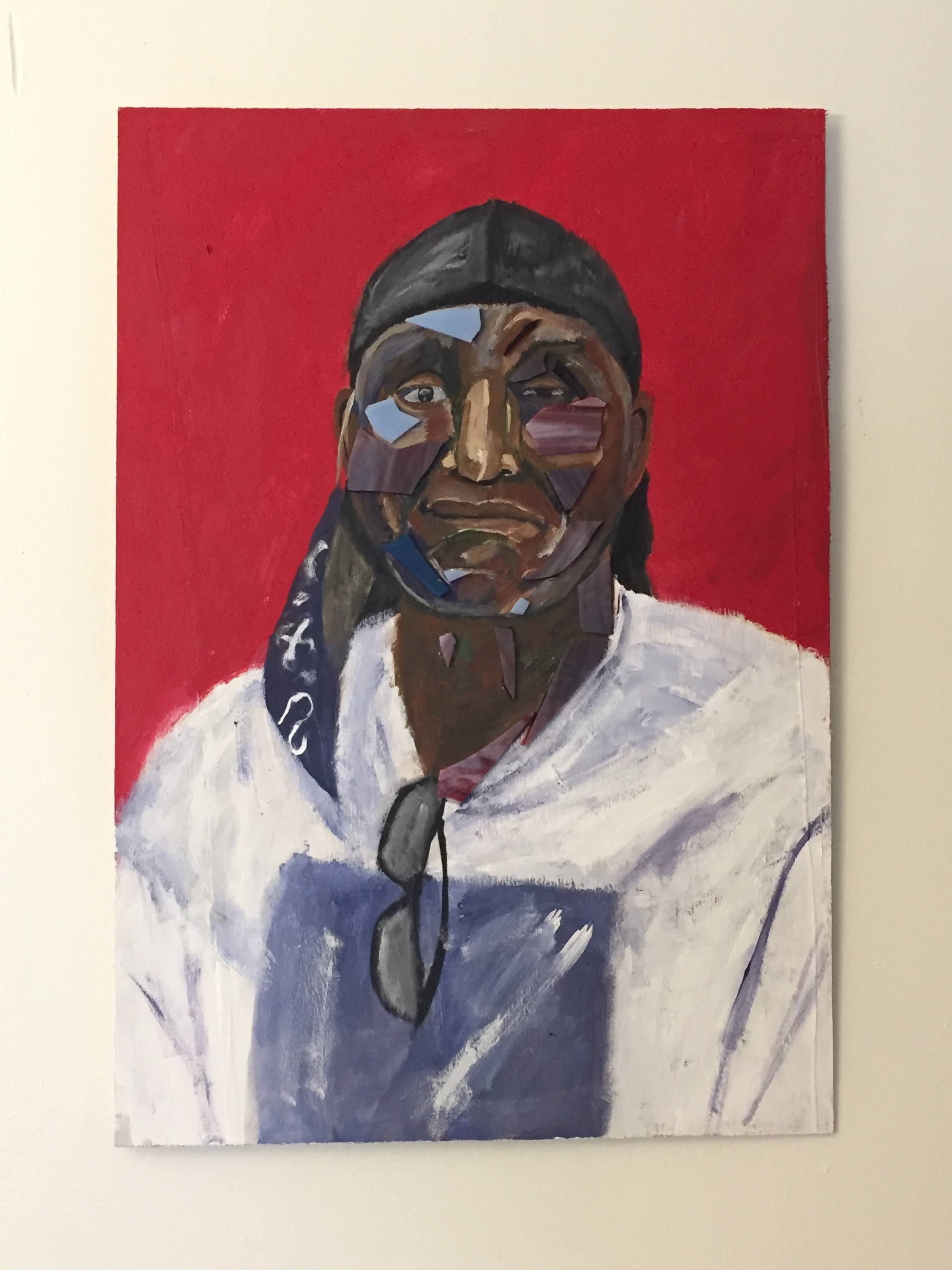

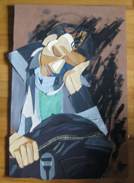
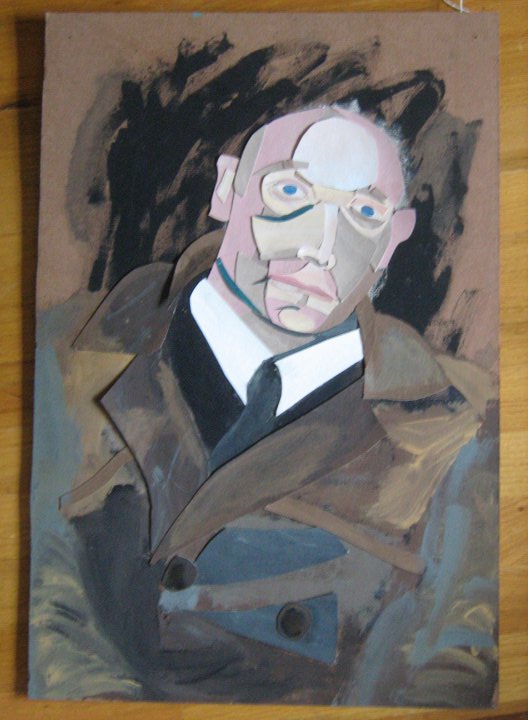
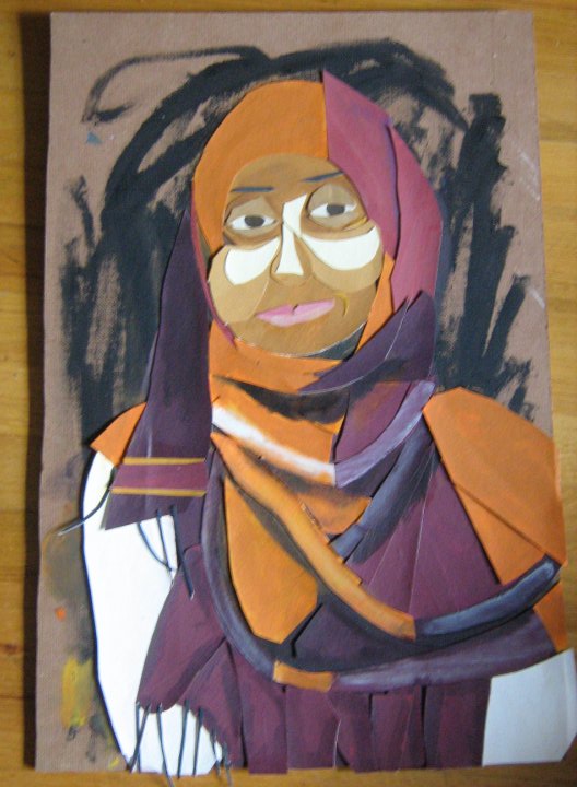
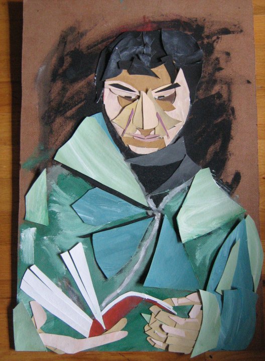
I had to dig the London portrait pictures out from my archives. I can’t believe I’ve never posted about them online. They were the first serious painting series I ever did and the first time I tried to do the human figure in a real way. It was…killer. I would cut all that paper up in my six person college living situation, slowly crafting the paintings together, revising constantly. Making that old woman look like a woman was a sixty hour process maybe. That could be an overestimation, but it might be accurate. I think it took me 11-12 months or more to finish all 8 of the London portraits. When I was finished I couldn’t believe I had made paintings that had worked as well as they did.
I think the new portraits have the spirit of the old ones, but are (hopefully) twice as interesting. One of the ideas I tried to do for the London portraits was to include semi-representative colors. At the time, blue was as good as I was able to do- wasn’t sure how to use red or green. Fauvists did stuff like that, though to be sure they had a wild color theory that unified what they were trying to do. I’ve been recently trying to approximate my way to a shared, gut level equilibrium between color and light. Sometimes in the new portraits the glass is color (like, a substitute color) or it’s a stand in for light. By not having a fully consistent rule about the glass, I’m hoping to arrive at a sense of fulfilling approximation.
Haven’t quite worked out the problem of the background of the London portraits. At the time, I was trying to do something purposely simple. I wanted to have the canvas (wood) show through while slightly representing the black of the glass behind the train riders. At the time, a bunch of people said it didn’t work . And…they were right. It mostly distracts from the portraits. What do I do then instead? I’ve been playing with ideas. Low resolution versions of the background the person was in when I took the picture, one color background, stroke pattern from cleaning by brushes, or intentional directional strokes.
I’m proud of my London portraits not being all just looking at the camera. Even then I figured that was lazy. It’s the easiest portrait for me to do, honestly, and I didn’t want to start by taking an easy way out. The last two portraits took around 3-5 hours each. Things have gotten better and easier- that’s what ten years will do, I guess.
I’ll post the rest of the London portraits at some point, talk about that time in my life. Once COVID ends and I can get more photos of people, I’m going to churn portraits out like a machine.
